Creating maps in Datawrapper is more than just a technical task—it is a powerful way to translate data into meaningful visual narratives. No matter your major, the ability to visualize data effectively is a skill that can distinguish you in your field. Whether you are working with numerical data or textual information, the capacity to convey insights through clear and compelling visualizations is essential. It enhances your ability to communicate complex ideas while making your analysis more accessible to a broader audience.
Datawrapper is a free online application that excels at creating visually appealing data visualizations. While tools like Microsoft Excel, Google Sheets, and Apple’s Numbers can produce attractive graphics, Datawrapper is a better choice for generating different types of maps. Its intuitive interface and specialized features make it particularly well-suited for mapping data, offering a level of detail and customization that other applications may not provide. Whether you are visualizing demographic trends, election results, or other geographic data, Datawrapper ensures your maps are not only accurate but also compelling and easy to understand.
Before using Datawrapper, it is essential to structure your data in a spreadsheet. Once organized, you can upload the data to Datawrapper. For map creation, your spreadsheet must include a column with geographical identifiers, such as country names, country codes, U.S. state names, or longitude and latitude coordinates.
In this tutorial, we will create a choropleth map. It uses different colors or shades to represent data across predefined geographic areas, such as countries, states, or districts. Each color corresponds to a specific value or range of values, allowing viewers to identify patterns, trends, and regional differences easily.
In this example, we will examine the ratification status of the Convention on Cluster Munitions, which came into force on August 1, 2010. This treaty requires state parties to eliminate the stockpiling and use of cluster munitions and to provide assistance to affected populations.1
In international law, states are not required to ratify treaties. As a result, they have three options:
- They can choose not to join the treaty.
- Sign it without ratifying it (which means they are not legally bound by its terms but should avoid actions that contradict its goals).
- Fully ratify the treaty and become legally committed to its provisions.
Where can we find this information? Since this treaty is deposited with the United Nations (UN), we can visit the UN Treaty Collection website and search for the treaty under the disarmament instruments category.
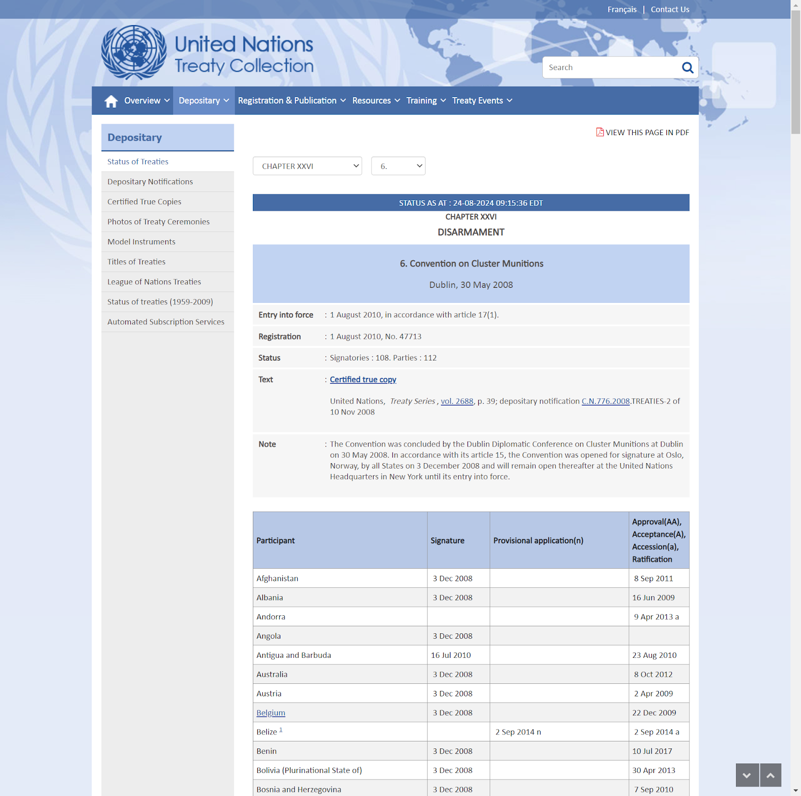
In this example, we will focus exclusively on mapping UN member countries, so we can disregard whether other jurisdictions (e.g., Taiwan) have ratified the treaty. The screenshot shows a webpage with a table containing four columns. We will replicate these four columns in a spreadsheet, as outlined below. The first column will include the country’s alpha-2 code (e.g., “AF” for Afghanistan and “AT” for Austria). The second column will list the country names.2 The third column will indicate the ratification status, which includes three categories: no action, signatory state, and state party. Additionally, we will include a column for the year each country ratified the treaty. While the year column won’t be used for the map, it can be useful for creating additional graphs to enrich the analysis.
To fill in the third column, determine each country’s ratification status. If a country has ratified the treaty, the UN’s table will display a date in the fourth column. For example, Albania ratified the treaty on June 16, 2009, so in your spreadsheet, you would record Albania’s status as a “state party” and enter “2009” in the “year_ratification” column. If a country signed the treaty but hasn’t ratified it, the UN table will show a signature date, but the fourth column (ratification date) will be blank. In this case, you would enter “signatory state” in the status column. If a country has taken no action regarding the treaty, it will not appear in the UN Treaty Collection’s table. Thus, you would enter “no action” in the status column. Additionally, you can add a “notes” column to the spreadsheet for any extra information.
The World Politics Data Lab’s GitHub repository contains a copy of a spreadsheet with this information. Here are the first entries, showing how the data should be structured.
| iso2 | member | status | year_ratification | note |
| AF | Afghanistan | state party | 2011 | |
| AL | Albania | state party | 2009 | |
| DZ | Algeria | no action | ||
| AD | Andorra | state party | 2013 | |
| AO | Angola | signatory state | ||
| AG | Antigua And Barbuda | state party | 2010 | |
| AR | Argentina | no action | ||
| AM | Armenia | no action | ||
| AU | Australia | state party | 2012 | |
| AT | Austria | state party | 2009 |
After collecting and structuring your data, you can proceed to Datawrapper to create your map. Follow these steps:
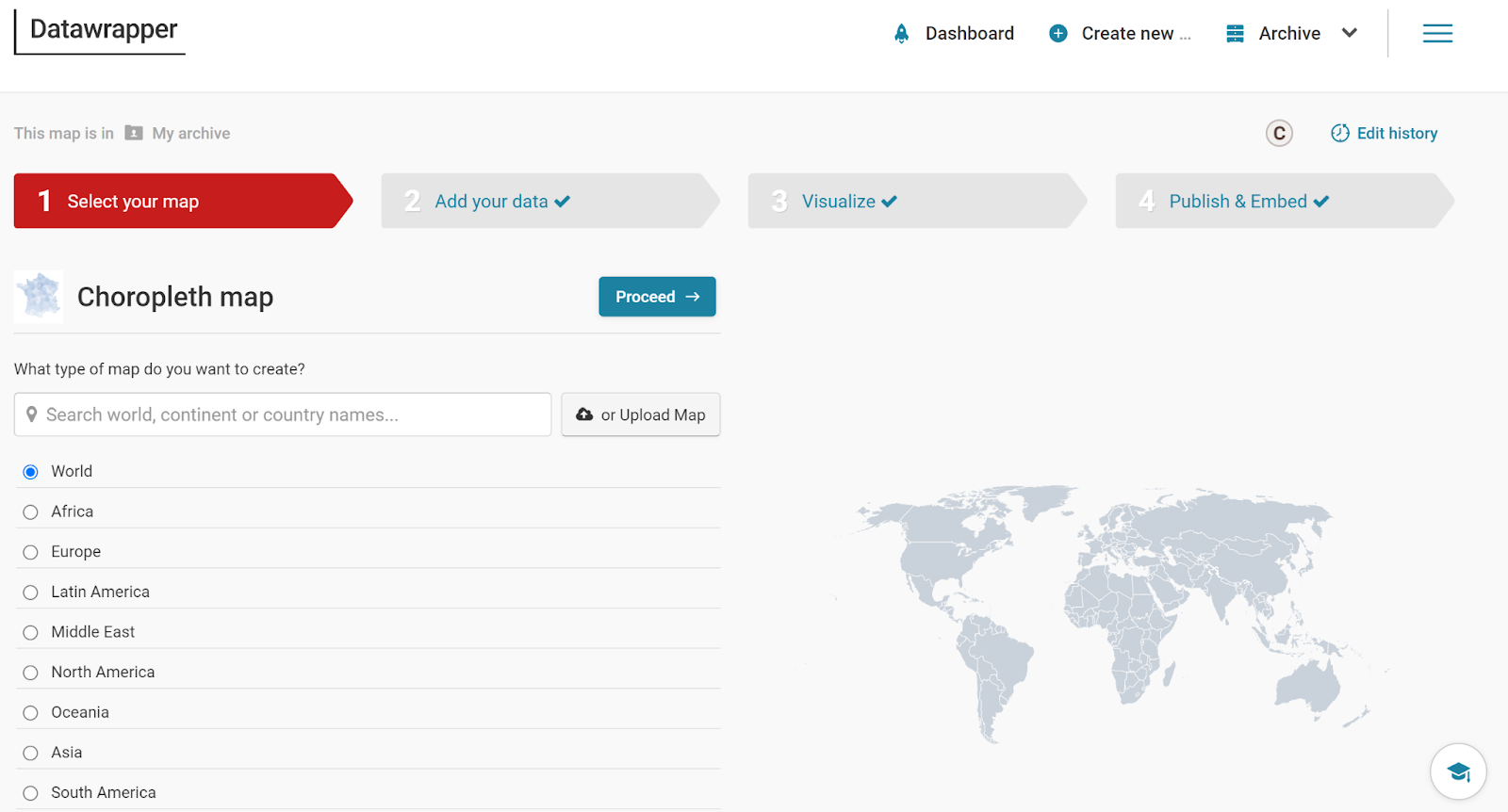
- Use the following link to access the map-making landing page directly.
- On the next page, you’ll encounter several mapping choices. For this example, choose the “World” option and click “Proceed.”
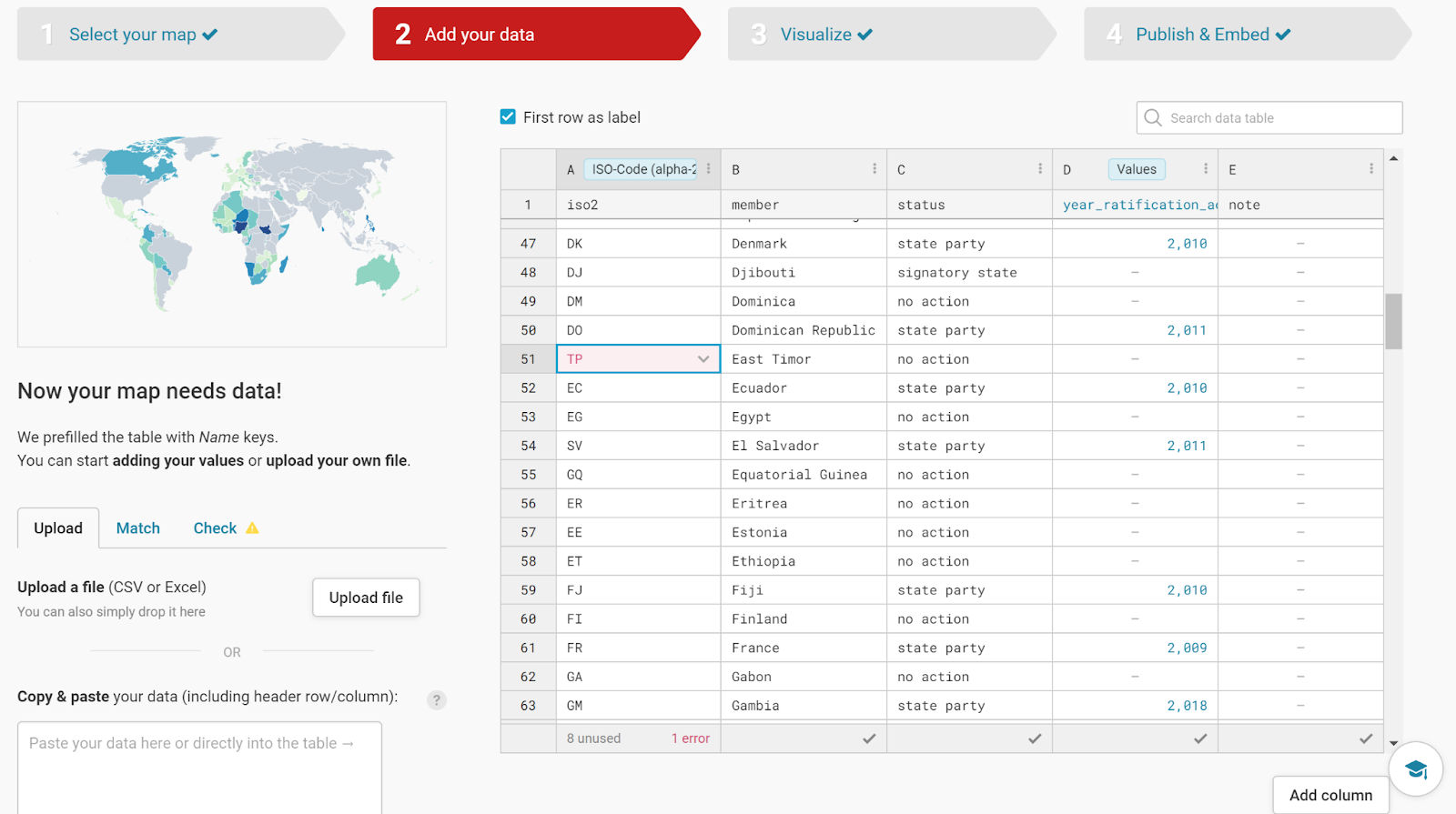
- There are several ways to upload data to Datawrapper. Although you can link a GitHub repository or Google Sheets directly, the simplest method is to download your spreadsheet as a comma-separated values (CSV) file or a Microsoft Excel file. Upload the file directly.
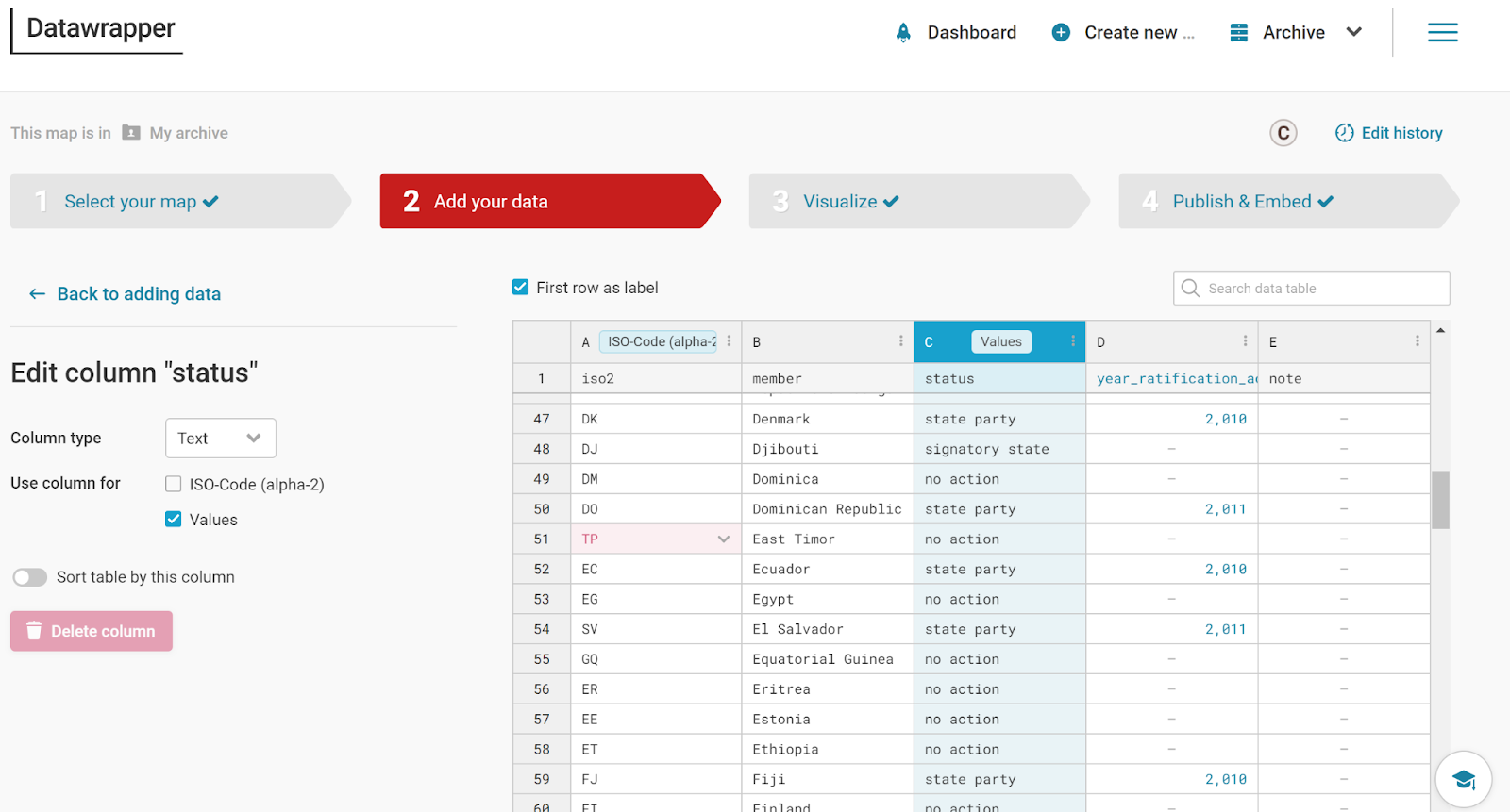
- Make sure that the data is correct. When Datawrapper reads the uploaded data it may pinpoint a problem. For example, in the file I downloaded from GitHub and uploaded to Datawrapper, the application noted that “TP” was not a correct alpha-2 code. It should have read “TL” for East Timor. Notice the error message at the bottom of the data table in Datawrapper. The application also highlighted the incorrect entry in red. To correct this error, double-click on the cell and enter the correct observation.
- To create a map, Datawrapper requires the ISO-Code (alpha-2) column to locate geographic boundaries and the values used for shading those boundaries. Initially, Datawrapper assumed that the “year_ratification” column represented the values. However, you want the application to use the “status” column instead. To adjust this, double-click on the “C” column, then on the left side of the screen, ensure the column type is set to “Text” and specify that this column will be used for “Values.”
- Click on the Visualize tab at the top of the screen to see the choropleth map. You can now refine the appearance of your visualization:
- Double-click on the “Insert Title Here” to add your map’s title.
- Customize the color palette and select colors for each observation.
- Add a caption and edit the labels, such as capitalizing each label.
- Under the advanced options tab, you can also choose the legend’s placement.
- You can adjust the map’s appearance further by adding “padding.”
- Finally, press the “Publish & Embed” tab. If you have an account, you can export your map as a PNG file to your computer’s hard drive and upload it to your document.
Here is a copy of the map generated by Datawrapper:
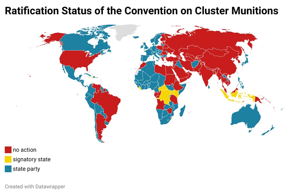
In conclusion, this tutorial has guided you through creating a choropleth map using Datawrapper, a powerful tool for visualizing geographic data. By following these steps, you have learned how to map the ratification status of the Convention on Cluster Munitions and gained valuable data preparation and visualization skills. These skills are essential for effectively communicating complex ideas and making your analysis accessible to a broader audience. Whether you are mapping demographic trends, election results, or other types of data, mastering tools like Datawrapper will enhance your ability to create compelling visualizations that support data-driven decision-making in your academic and professional endeavors.
Footnotes:
- For a more in-depth analysis of this convention, see the following. ↩︎
- To download a data frame with a column for UN members’ country name, ISO2, and ISO3, visit the World Politics Data Lab’s GitHub repository. ↩︎

